Fonts, Figures, Facades: Towards a New Formalism of Architecture
This thesis posits a new mode of contemporary design through the translation of typography’s syntactical elements into architectural tectonics.
Project
Mixed-use
Timeframe
2024 – 2025
Thesis Statement
A new formalism challenges modern value systems and a world engineered for order and efficiency. This thesis posits a new mode of contemporary design through the translation of typography’s syntactical elements into architectural tectonics. Similar to how architecture can be understood through tectonics and design language, typography is distinct by its anatomies and how these contribute to a known language. There are large parallels between the way typography is read and how architecture is experienced. Thus, typography becomes the vehicle through which a new formalism operates. This design language places emphasis on aesthetic and gestural moves that shape a deeper narrative. It also challenges classical means of extrusion and explores alternative modeling techniques to produce architectural form. In an increasingly automated world, a new formalism celebrates an interest towards craftsmanship, identity, and narrative. Typography, as a deeply human form of communication, becomes an expressive medium for reclaiming intentionality and creativity.


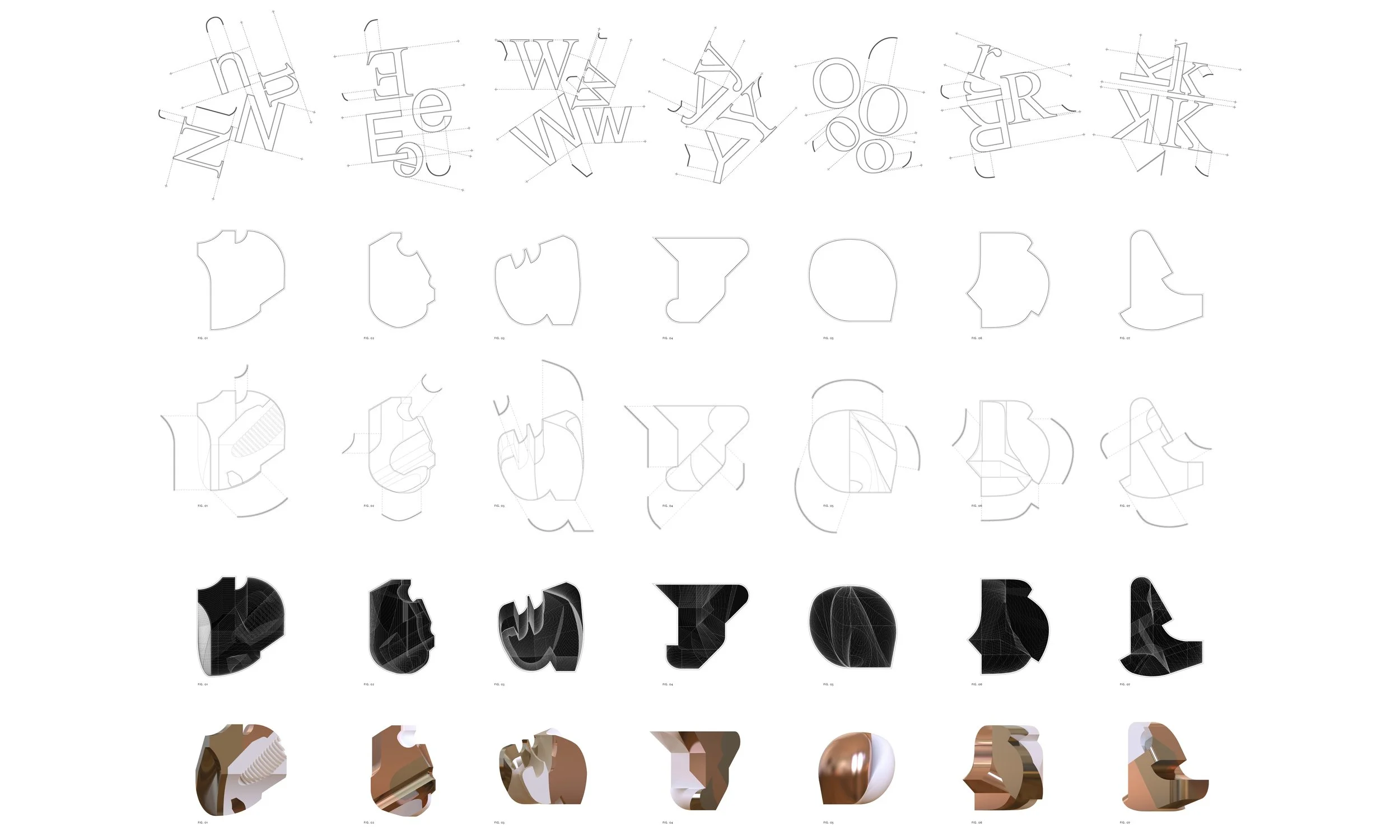
Typography contains much more intention and meaning than the arbitrary scaling or visual arrangement of letters—it is systematized, orderly, and demonstrates intentionality through rhythm, hierarchy, and tectonic gestures: the anatomies that make up a typeface. Through these tectonics—serifs, stems, ascenders, bowls, strokes, loops, and crossbars—typography holds the ability to communicate ideas and meaning through a language. These tectonics play a critical role in defining the legibility, character, and ensure clarity and continuity in written and visual communication.
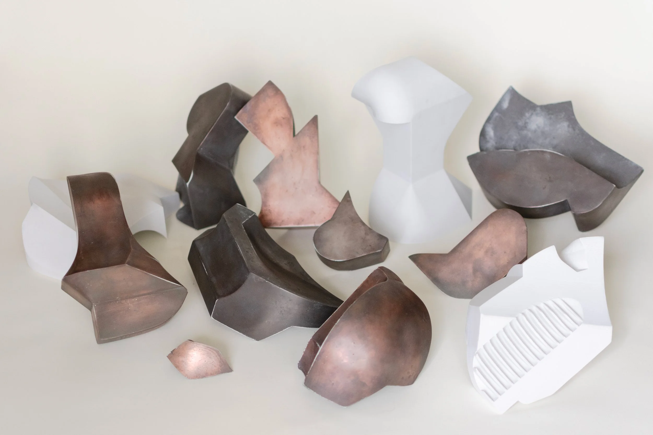
Typography, traditionally understood as a flat and visual system of communication, becomes an unexpected yet potent generator of spatial complexity when pushed beyond the page. Typographic elements—such as serifs, stems, and strokes—are no longer confined to their planar graphic representations. Instead, these are treated as tectonic elements, each with their own spatial implications. These studies translate the nuances of typography into three-dimensional proposals, and hence architecture, through various modeling procedures.


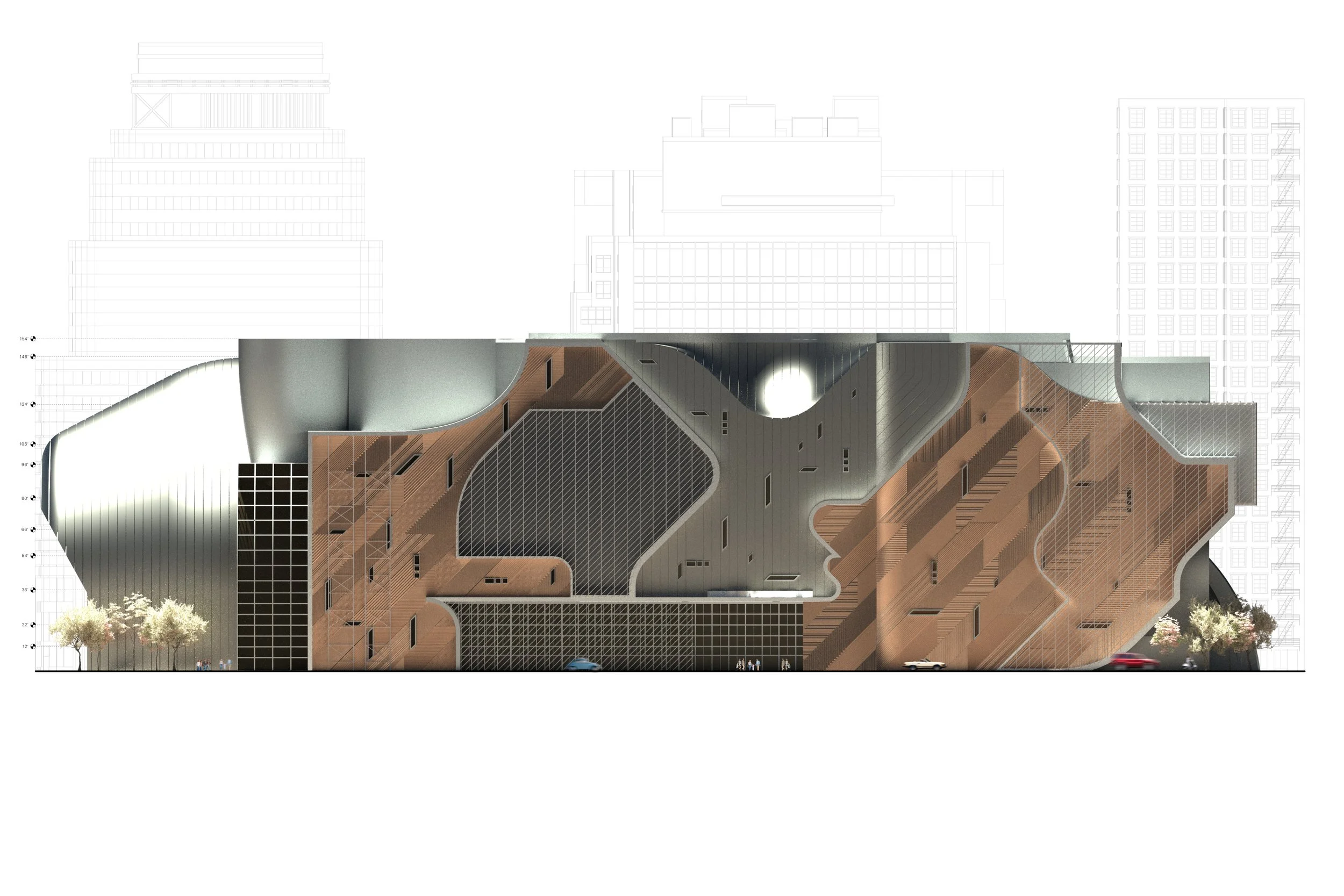
Elevation
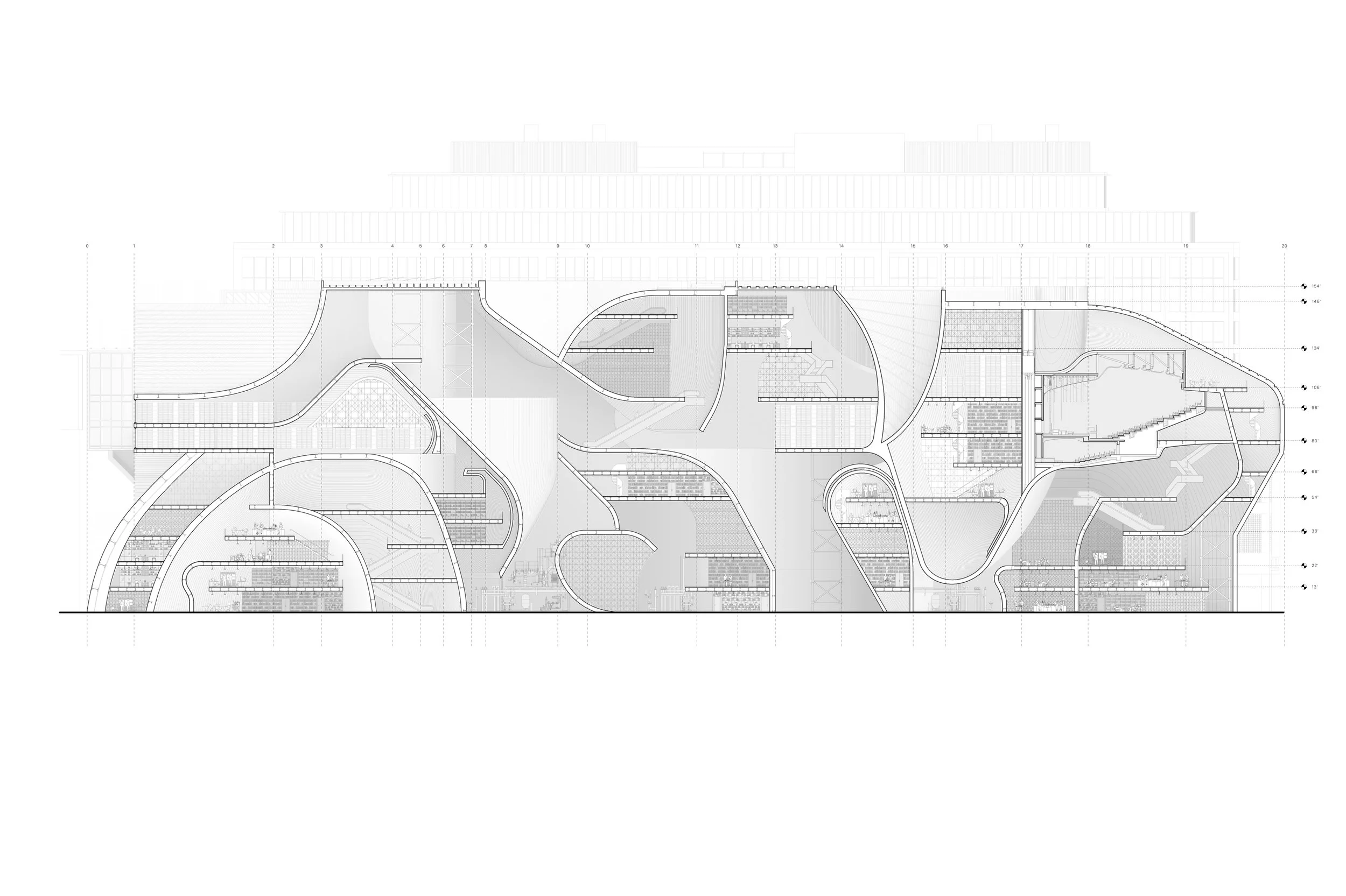
Section

Site Plan
The spatial relationships within typography parallel architectural composition, where proportions and alignments dictate order and meaning. Just as a well-designed building organizes space for functionality and experience, a well-structured typeface orchestrates letters and spacing for optimal legibility. Beyond its being as a medium of communication, typographyʼs primary function is to express tone and identity. A serif font might imply ideas of modernism or some extent of historical significance, whereas a sans-serif font may evoke ideas of minimalism or neutrality. Understanding the characteristics and relationships of letterforms enables typography to become a language of form.
In the context of New York City, these resolutions hold additional meaning in consideration of its history, density, and sense of place. The architectural interplay between grid and gesture in New York mirrors the dual logic of typography: predictable yet expressive, systematized yet meaningful. Furthermore, it supports the visual and spatial rhythm of New York. Typography thus becomes a lens to reinterpret the city—not just as a backdrop, but as a field of encoded language.